Thursday 6 September 2012

Stylising with jewellery

I have taken these pictures myself of some of my necklaces which I think reflect well for the Alice in Wonderland film. I know this is not what my Boogazine subject is about but I like the camera images how they blend in the background and the foreground is clearer and sharper.


Tuesday 31 July 2012

Yet Another Idea:

After coming back onto my blog, I have looked back over my previous ideas and thought how to find a middle ground over them. The main thing is coming from films and with the whole clock idea, I have been thinking back to what films include them. As said in a previous blog post, I thought of Peter Pan and now Alice in Wonderland.

Personally I love fantasy films and Alice in Wonderland is definitely a world wide favourite. I know what type of styling I want on my Boogazine and I feel that something as mismatched as this film and its designs and clothing etc. will reflect that very well. I want it to be quite shabby sheek in a way that it fits in with a kind of modern twist as well, to attract a wider range of viewers.


Like Peter Pan, even though the clock is not a main part of the film, it is still a memorable moment that people easily remember. The clock (or pocket watch) is seen with the rabbit and a famous line that many people who have seen the film can recite word for word, 'I'm late, I'm late, for a very important date. No time to say ''Hello, Goodbye'' I'm late, I'm late, I'm late.' makes people think of the rabbit and his pocket watch.


Just to prove my previous paragraph, here is the rabbit himself, pointing at the pocket watch.


Alice in Wonderland:
                                                                 Source: dekotante-rockmyhome.blogspot.de via Heather on Pinterest


The image above links with the tea party with the mad hatter, the clock that links with the white rabbit and a white rabbit ornament. This stylised image is what I would like on my Boogazine to keep in with my style.

Wednesday 11 July 2012

A bit of editing:

As you look at a magazine there are images inside and out. I want to stick with the vintage for this and having such photo editing software as Instagram available, the images can attract particular viewers. If you have just writing on a page it does get boring and I want the images to be the centre of attention so to speak.


Weather this is just an excuse to show off my holiday pictures or not but these are the type of images I have just talked about:


These are the effects that many people are using to edit their pictures and as it doesn't seem to be going away any time soon, I find this can be a useful way to edit the photographs and pictures on my Boogazine.

Tuesday 10 July 2012

Collection of College work:

After looking back through some of my College and University work on my previous blogs, I have come across some stylised work that I think would reflect well with my idea of vintage and the uniqueness of design. I have been unable to locate my old textile sketchbook but I have managed to find this image of two of the pages. This picture was initially taken for my portfolio.


I have enlarged the picture to show more of the detail in the sketchbook. The inspiration for this was taken from an artist called Betty Petter and I have tried to recreate her style into my own designs and this is what I came up with. As you can see I have taken pages out of books (not my favourite's) and created shapes with the paper and used the natural materials and colours to recreate the background design. My favourite part of this is how the wire is incorporated into it, elegant little pieces that reflect the designers jewellery. 

This is an idea of how I would like my Boogazine background to look like. Very much like the clock designer, I want to make it unique and to give it this personal touch by maybe creating it by hand first and incorporating it in that way. I wouldn't have it as bold, probably change the transparency, so it doesn't take the viewers eye away from the article.


Here are two more images of textiles I have produced and these would also work well in the background design of the Boogazine. 

Monday 25 June 2012

Option 3: Post 3

The designer that I want to look at, Roger Wood, creates time pieces such as this. They are one of a kind and he uses anything that he finds and adds them together to create such wonderful pieces. Looking at the image below, you can see a small horn, a meter and wheels. They are not usual things to see on a clock but when they are put together they work well.

Vintage is a one of a kind thing, and these clocks are one of a kind. I want to include these types of miss matched things into my Boogazine, making it original and unusual for the reader. This will also catch their eye as it is nothing they are quite used to, this and my style idea of vintage will keep the viewer intrigued as to what will appear next.  


With designs like these they can be up for discussion, asking different people about their opinions and weather they would purchase or design such a clock. This could also show how the old can link with the new to create this classic type timepieces. It all links together and I would like to reflect that in my Boogazine how everything can be re-used or recycled and also show the viewer what other possibilities can be achieved, just by taking a simple clock and making it into something magical.


Below I have added some general clocks that I have around my house. Although some of the designs are simple and don't have a huge wow factor, they all have individual traits so to speak, that make it different from the next.


As you can see, the all have a unique feature that is very appealing to the eye.


Option 3: Post 2


Even though my ornaments are not one of a kind I still like to buy things for their vintage looking quality. Pictures are a great way to express and show other people what you like and your style. These pictures I have taken myself and tried to recreate the vintage look that I admire.


Here I have added a few more images of clocks. These are my style and I always aim to decorate my interior in this style, but not too much as I feel that it can sometimes be over powering. Every individual clock has a very unique face and looking at these images you can see how each effect can still be understood. This meaning that some have clear numbers and others can have roman numerals. 

As said before, a clock is a piece of time keeping and there are other ways to tell the time like sundials which can be developed into the design of a clock. For example, the sundial can be attached to a watch as a design subtly linking the old with the new, giving it a great effect.

Option 3:

In the summer holidays when I have nothing to do I like to watch films and when I have my niece and nephew round they like watching the old Disney films and one of their favourites is Peter Pan. One key point in the film has always stuck in my mind and after adding my style images onto the blog, it made me think back to that key part. The clock. It appears in different points within the film as it lets captain hook know that the crocodile is near by ticking.

Now focusing more on the clock, I want to see how it fits within everyday life:
  Although not usually depicted as an item of furniture, a clock is always a constant appearance in every home, weather it be on the wall, on the cooker or microwave, or even someones DVD player. As everyone knows a clock is a time piece and helps people keep track of what happens through the day, to check when it is tea time or to pick the children up from school. So I want to research into time keeping and different ways of doing so.

After doing some extended research into clocks and clock makers, I have found a designer whose work is a lot like my style as it is handmade and one of a kind. This links back to the vintage side of things which is personally interesting to me so I know that I can relate well to this idea. The designer or clock maker is Roger Wood and after looking at his website I want to work my Boogazine around him and clocks and link it with the vintage. As clocks link to time, I would like to go back in time to older clocks such as grandfather clocks and then work my way up into modern day clocks and how people are reinventing them, making them old fashioned again and bringing the styles back around. 


Here is a video about the designer himself and the clocks that he has made and what inspired him to make such amazing and one off clocks. He is a very inspirational person and I would like to create such great pieces of work. For me I like different things, things other people don't have and after looking at his work I want to focus on getting other people's attention that this is possible. 


Sunday 24 June 2012

Option 2:

To go nearer to my subject area, I have looked into Architects and Interior designers. After researching through the internet links that have previously been given to us, I have found a few people's work that I like the look at.

I looked at MM++ Architects and was drawn into the website by looking firstly at the projects. My eye immediately fell on The Brown Cafe. This cafe was finished in 2011. What I love about this design are the colours, as I feel that they are relaxing and very fitting with things you sell in a cafe; such as coffee and cake, but also the font and the illusion that it gives. Looking in on the plan I am a fan of the layout and how they utilize the space and make it still feel open and light.

The front of the shop is quite inviting with its large openness and also the far right of the shop where the font is mixed about to spell out the coffee shops name. Even though the font is at different sizes your mind can still register what it says and I like how the text blends into the posts. 

To research further into this style and find the meaning behind the colours, font and text; may give us a clearer understanding on why they were chosen and what effect they have on different people.


Option 1: Post 2


In the previous blog post, I mentioned about the impossible stairs. These are also known as the impossible staircase, or the Penrose Stairs. There is also a similar illusion called the Shepard Tone which works with sound. The stairs are two dimensional. The make four 90 degree turns, making it into a continuous loop so that the walker can keep climbing the stairs but they are never getting any higher, although the illusion makes you think that you are. The steps are seen as a psychological subject as your mind has to think about what is happening and to understand the concept.

For the project this can be seen as an architectural style or maybe even the film itself can be the main piece of the 'Boogazine'. I can easily mention the film and give the outline of how I found this style of stairs and work that into my 'Boogazine. This is because I find that if an outsider so to speak, knows the origin of the idea, they can understand it a lot more and they can also work through the development with me and see how I came about the idea and also the other possibilities that the design has. With an idea like these stairs, it can branch off into different areas that can be researched into further, these could include:
  1. Architecture
  2. Interior
  3. Illusion
  4. Psychology 
  5. Film
  6. Perspective
  7. Dimensions
As the 'Boogazine' needs to be critical of the object/subject. Having different areas to look into I can easily be critical of specific areas rather than of the object itself. As the 'Boogazine' needs to be visually referenced I could also include my own perspective drawings, from 1 to 3 point, also other people's drawings and ideas of these stairs. Paintings have also been made referencing or even copying these stairs so I can also include pictures of said painting, showing other people's ideas and designs of how the stairs should look.


Option 1:

The 'Boogazine' could easily be about a film or something within the film that could link to Interiors/Architecture. After reading back over that first sentence, the word Architecture sprang out at me and although this film isn't directly about Architecture, it has Architecture within it and also Architects. The film I am thinking of is Inception.

The plot of the film itself is about people who can enter the minds of others through dream invasion. A highly skilled thief (Leonardo DiCaprio) is given a last chance at redemption which involves him doing his biggest job to date: Inception. 

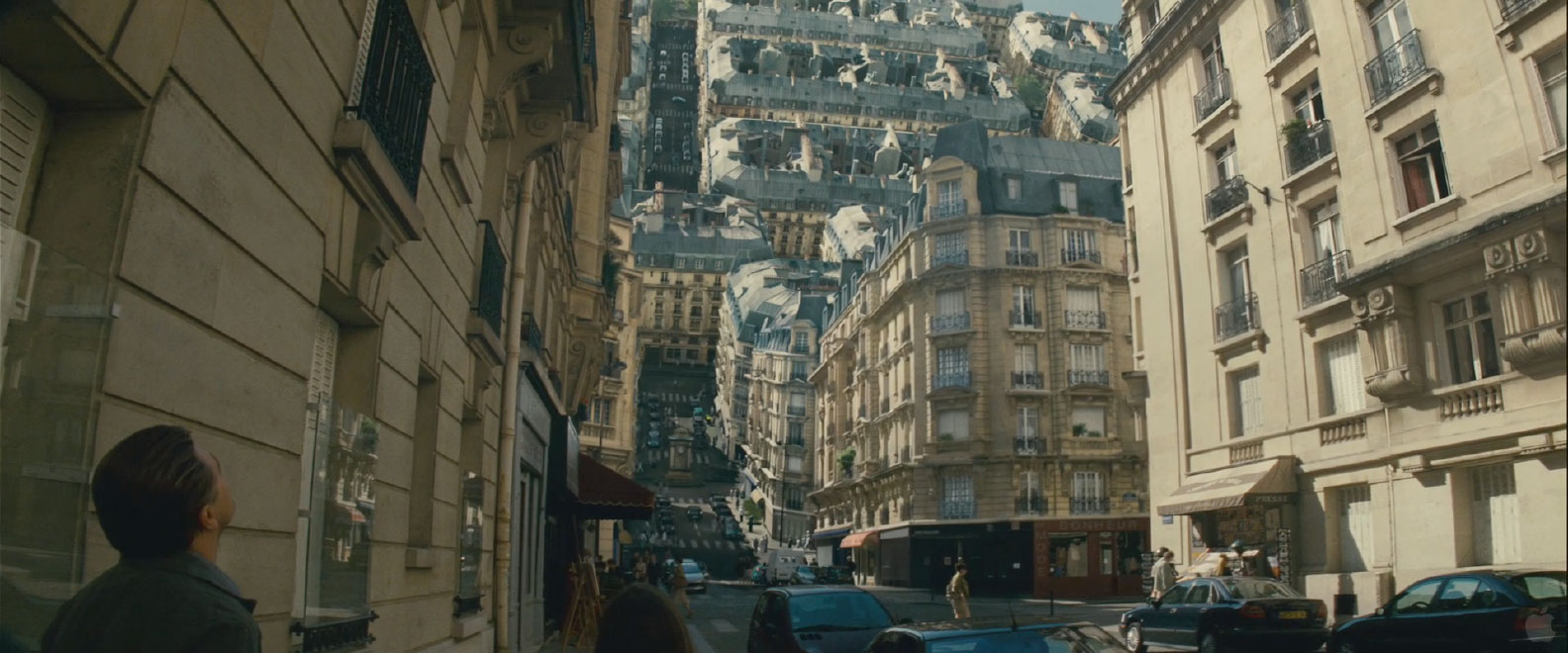
Within the film, the people who are involved in the Inception have different jobs to do, one of which, is an Architect. This person plans out the route's and buildings within the 'dream state' to make the dreamer believe what they are seeing is actually real. In the film itself, the dream maker or the person whose dream it is, can manipulate things while in the dream. One scene in particular shows how they make the whole buildings, floors, roads, trees etc. in a city, move as though a piece of paper is being folded over, which shows the buildings being on top of one another, making a kind of upside down world.


For some extended research into this, I could experiment with origami and try it out for myself to get different perspectives and view points. The bottom image is of it folding in progress and it does land on top so when you look up and expect to see the sky, all you will see if roads and buildings.

Another key scene within the film are never ending stairs. These can be also called the impossible staircase as it is a 2D depiction of a staircase. This means that the stairs make four 90 degree turns so that they form a continuous loop, so the person could climb and climb but never get any higher. 

Later in the film the buildings start to become derelict and are falling down, this is when someone's dream state starts to collapse around them and I like the look of it all falling down and I think it looks like an impressive bit of Architecture.

Saturday 23 June 2012

My Style:


These are just a few pictures that I have taken myself of my own personal vintage style items that I own. Although they are not linked to Architecture exactly, but along way down the line they somehow link to Interiors. These show my initial style and I want to somehow incorporate that into my 'Boogazine.'

A bit of Inspiration:


These are some websites that my tutor has given us to help us get started and see what is expected for the 'Boogazine.'

Some Websites/Blogs:

http://www.thersa.org/

http://www.thersa.org/projects/design/student-design-awards

http://www.designboom.com/eng/

http://www.spacecollective.org

http://www.metropolismag.com/cda/

http://www.thecoolhunter.co.uk/design/

http://www.haque.co.uk

http://www.metropolismag.com/cda

http://www.fxmagazine.co.uk

http://www.pingmag.jp

http://www.dezeen.com

http://www.loop.ph

http://www.fourthdoor.co.uk

http://www.mocoloco.com

http://www.metabolicity.com

The Project Brief:

Here is my new project for my 3rd Year at University - The 'Boogazine'

The Project Brief is this:

In Semester 1 you will be required to produce a document called the “Boogazine”, a piece of research and critical enquiry in the form of a magazine. Significant emphasis should be given to visual material in the work.


You are required to propose an object that you wish to research and to take a particular critical position about that object. ‘Object’ in this context is something that exists, or has existed in historical time. It could be anything as long as it:


connects directly to interior design/architecture and 
you can research it in depth in order to develop and sustain a line of critical enquiry.


It should be also be something that you personally find interesting. It can be a building or interior, but it could also be for example, a film, design movement, item of furniture, architectural style , designer, book etc.. Your Boogazine should aim to find something new to say about the object.


In a nutshell, I have to choose an object which connects to interior design/architecture and create a 'Boogazine' about it. To work outside of the box I want to broaden my research and delve deeper into each subject area, rather than just go for the obvious option. As the brief says it should be something I personally find interesting, the first word that springs to mind is 'Vintage.' So what I will hopefully aim to do is start off with Vintage and work my way up into the now, where vintage is coming back and re-inventing itself. For my research into the Vintage I will start looking into as early as the 1920's to find inspiration. Although, rather than do what I know, I may differentiate between styles and research into area's I am not familiar with.