Tuesday 31 July 2012

Yet Another Idea:

After coming back onto my blog, I have looked back over my previous ideas and thought how to find a middle ground over them. The main thing is coming from films and with the whole clock idea, I have been thinking back to what films include them. As said in a previous blog post, I thought of Peter Pan and now Alice in Wonderland.

Personally I love fantasy films and Alice in Wonderland is definitely a world wide favourite. I know what type of styling I want on my Boogazine and I feel that something as mismatched as this film and its designs and clothing etc. will reflect that very well. I want it to be quite shabby sheek in a way that it fits in with a kind of modern twist as well, to attract a wider range of viewers.


Like Peter Pan, even though the clock is not a main part of the film, it is still a memorable moment that people easily remember. The clock (or pocket watch) is seen with the rabbit and a famous line that many people who have seen the film can recite word for word, 'I'm late, I'm late, for a very important date. No time to say ''Hello, Goodbye'' I'm late, I'm late, I'm late.' makes people think of the rabbit and his pocket watch.


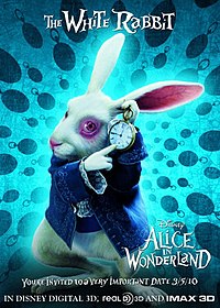
Just to prove my previous paragraph, here is the rabbit himself, pointing at the pocket watch.


Alice in Wonderland:
                                                                 Source: dekotante-rockmyhome.blogspot.de via Heather on Pinterest


The image above links with the tea party with the mad hatter, the clock that links with the white rabbit and a white rabbit ornament. This stylised image is what I would like on my Boogazine to keep in with my style.

Wednesday 11 July 2012

A bit of editing:

As you look at a magazine there are images inside and out. I want to stick with the vintage for this and having such photo editing software as Instagram available, the images can attract particular viewers. If you have just writing on a page it does get boring and I want the images to be the centre of attention so to speak.


Weather this is just an excuse to show off my holiday pictures or not but these are the type of images I have just talked about:


These are the effects that many people are using to edit their pictures and as it doesn't seem to be going away any time soon, I find this can be a useful way to edit the photographs and pictures on my Boogazine.

Tuesday 10 July 2012

Collection of College work:

After looking back through some of my College and University work on my previous blogs, I have come across some stylised work that I think would reflect well with my idea of vintage and the uniqueness of design. I have been unable to locate my old textile sketchbook but I have managed to find this image of two of the pages. This picture was initially taken for my portfolio.


I have enlarged the picture to show more of the detail in the sketchbook. The inspiration for this was taken from an artist called Betty Petter and I have tried to recreate her style into my own designs and this is what I came up with. As you can see I have taken pages out of books (not my favourite's) and created shapes with the paper and used the natural materials and colours to recreate the background design. My favourite part of this is how the wire is incorporated into it, elegant little pieces that reflect the designers jewellery. 

This is an idea of how I would like my Boogazine background to look like. Very much like the clock designer, I want to make it unique and to give it this personal touch by maybe creating it by hand first and incorporating it in that way. I wouldn't have it as bold, probably change the transparency, so it doesn't take the viewers eye away from the article.


Here are two more images of textiles I have produced and these would also work well in the background design of the Boogazine.